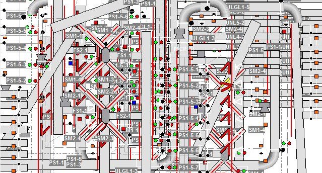
How many times have you been on a job site and been asked to solve an unexpected problem that arises with the system? Every controls engineer who has been in an industrial setting, for even a short time, has faced this situation. Typically, the first move is to check the HMI, or Human-Machine Interface. An HMI is one of the best ways for employees to interact with and observe the state of the equipment they work on. While there are many factors that go into the development and design of an HMI application, the two most important things to take into consideration are clarity and simplicity.
Clarity
Having a clear HMI display is crucial when the system goes down. The operator needs to be able to distinguish what a symbol or object represents in the field. If the operator spends more time searching screens to find the information he or she needs than they would chasing the physical problem in the field, then your HMI is not clear enough. This might sound obvious, but too many times, someone creates an HMI without considering the actual functionality. It is very important to keep the user in mind when designing your HMI. Giving objects clear and accurate labels and making the objects depict, as closely as possible, what the object physically looks like will greatly decrease the amount of down time a customer will experience when using your HMI. Another thing to consider when designing is the contrast between the colors that are used. If two aspects of the system are supposed to represent completely different things, make their colors distinctly different to avoid any confusion.
Simplicity
Simplicity of an HMI application, like clarity, is an important characteristic when it comes to finding a quick solution to a problem. The “Less is More” mantra is precisely the strategy you want your HMI design to follow. The main question to ask yourself is, “What information is essential to the operator?” A good practice is to give the operator only the information he or she needs to monitor and troubleshoot the system. The addition of extraneous detail will only lead users down the wrong path to the solution. A cluttered screen only overwhelms an operator when he or she instead needs composure to focus on solving the problem. The bottom line: keep it simple.
In the end, a break in production is one of the worst and most stressful things that can happen in an industrial setting. When creating an HMI application, keep in mind that you are creating a tool to help others in a huge way. Being able to quickly locate and solve a problem not only helps the employee succeed, but also ultimately helps the customer succeed. After all, as an integrator, that is our goal.
Brady Chandler - Engineering Scrum Master
Brady joined Spring in 2017 and has been involved with many projects for multiple parcel customers since. Over the course of a project, he has completed engineering work such as design, programming, and system start-up while also overseeing electrical installers.
Prior to Spring, while in college, he worked in a food manufacturing facility where he served as an intern guided by an engineering team that helped him to learn the basics of the manufacturing industry. He picked up many skills while working here, most of all learning the ins and outs of AutoCAD as well as getting the opportunity to assist in an expansion project in a new section of the facility.

